Why Mobile First Matters
Mobile usage continues to grow across every industry, and Chicago audiences rely on their phones to research services, browse options, and compare businesses quickly. If your site is difficult to navigate on mobile or forces users to pinch, scroll horizontally, or wait for slow loading pages, they move on immediately.
A mobile first approach solves these problems by designing the smallest screen experience first. This ensures clarity, speed, and readability before expanding layouts for larger devices.
Designed for Every Device
Responsive design adapts your content to each device without sacrificing quality. Images resize, text reflows, and layouts shift to match user expectations. This improves your brand presentation and creates a smoother browsing experience for your visitors.
Chicago users expect websites to function well on the go. Responsive design ensures your site feels professional from the moment it loads.
Improved Performance and Faster Load Times
Mobile visitors abandon websites quickly when pages feel slow. Responsive development focuses on performance, minimizing large file sizes, avoiding unnecessary scripts, and streamlining assets so the site loads quickly across all networks. Fast loading improves engagement and keeps visitors exploring your content.
Performance is especially important for mobile users accessing your site through weaker signals or crowded networks common in metropolitan areas.
Accessibility for All Users
Responsive web design supports accessibility by ensuring content is readable, navigable, and easy to interact with across different devices. Buttons remain touch friendly, text remains legible, and layouts remain intuitive regardless of how visitors browse. This improves the experience for every user, not just those on mobile devices.
Accessibility is becoming a requirement, not a bonus. Responsive design helps meet today’s expectations and builds trust with all users.
Why Chicago Businesses Choose Our Responsive Design Services
Local businesses choose Rawcut Creative because our responsive design approach blends mobile first strategy with thoughtful content structure and strong performance standards. We build websites that serve visitors wherever they are and whatever device they use.
Your website becomes easier to navigate, faster to load, and more consistent across every screen size. This leads to better engagement and stronger outcomes.
Capabilities
- Mobile first responsive web design for Chicago organizations
- Layouts that adapt cleanly across all screen sizes
- Performance improvements for faster mobile load times
- Accessibility focused design for a wider audience
- Custom WordPress development that supports responsive structure
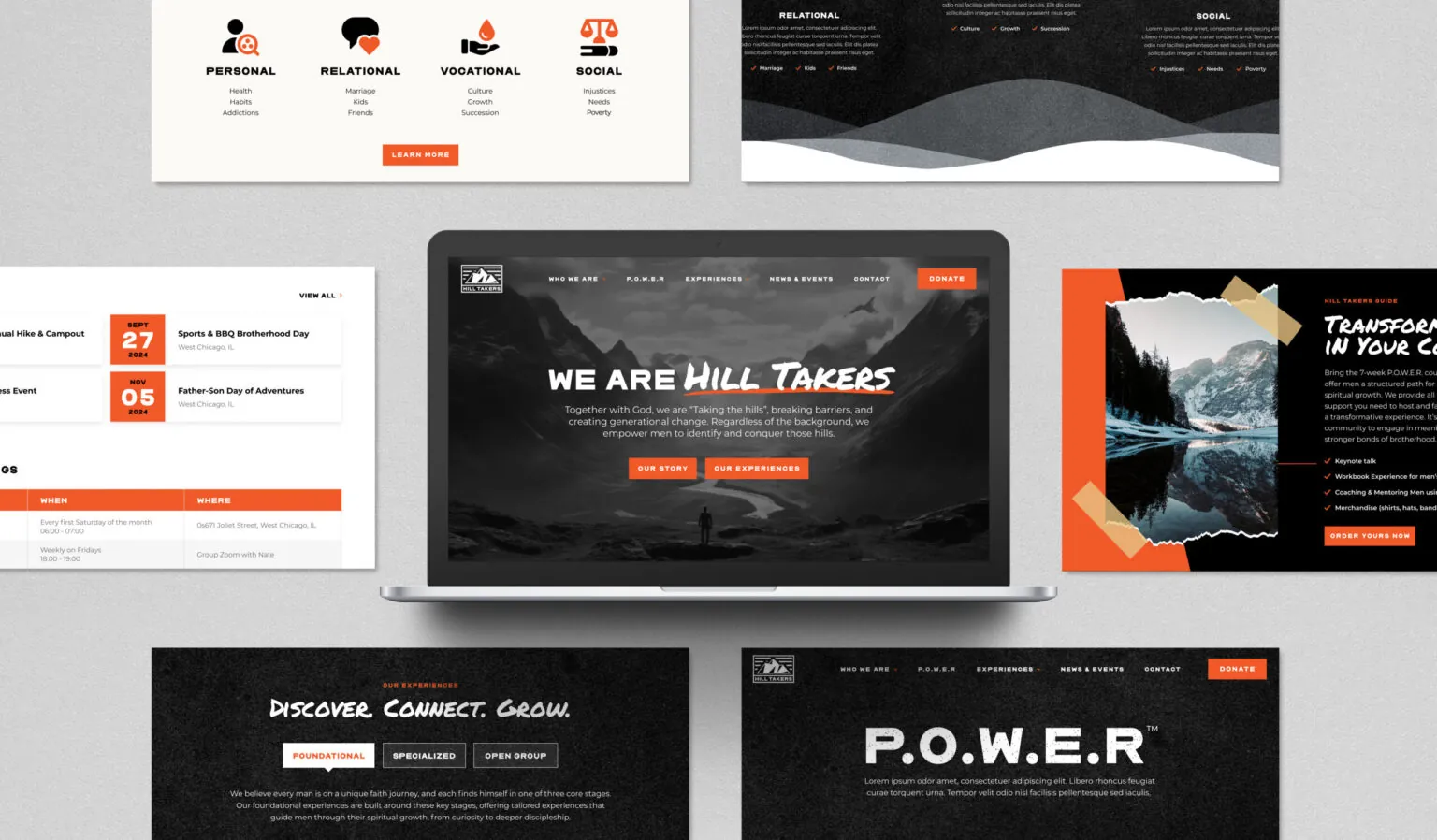
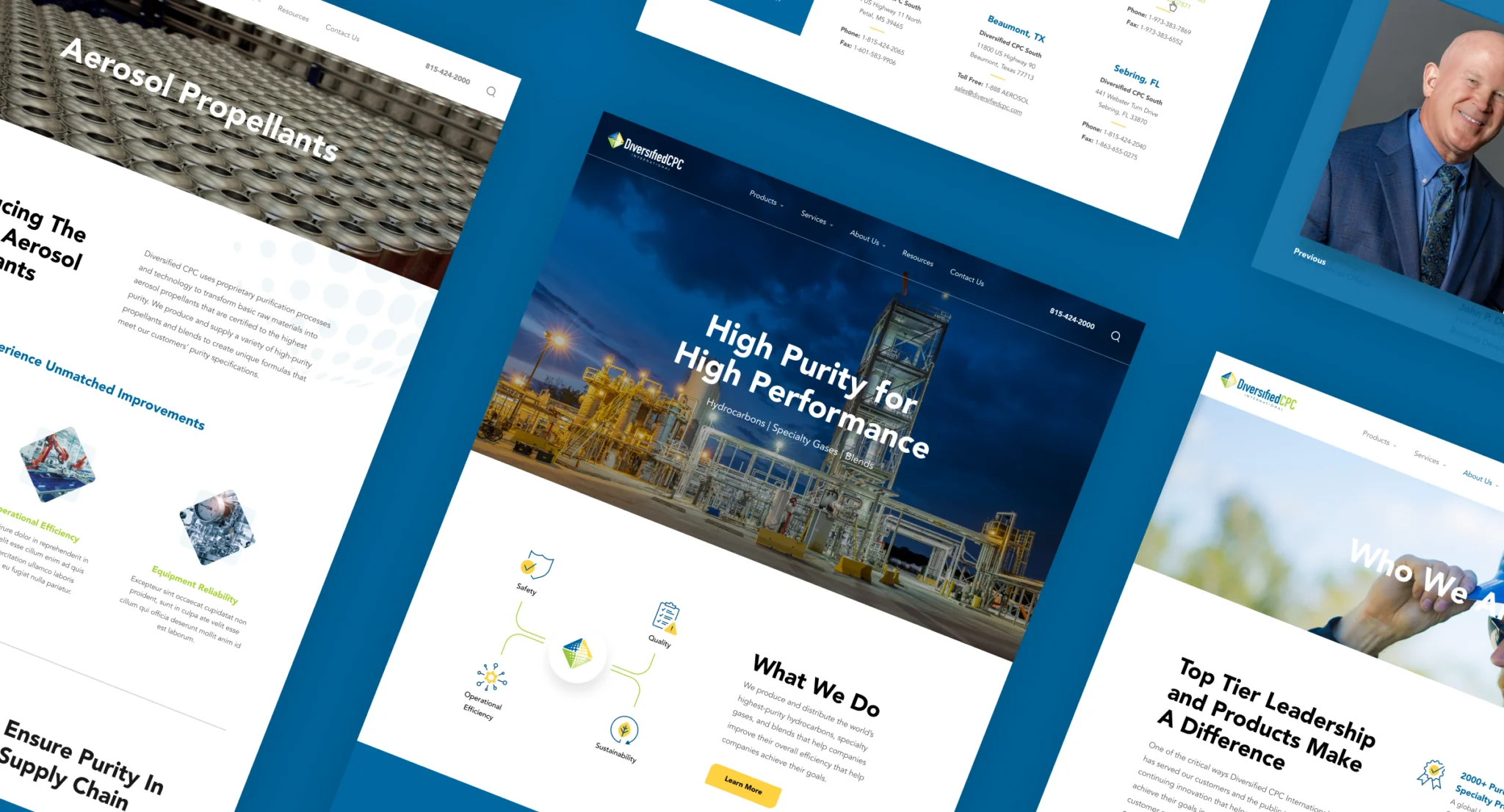
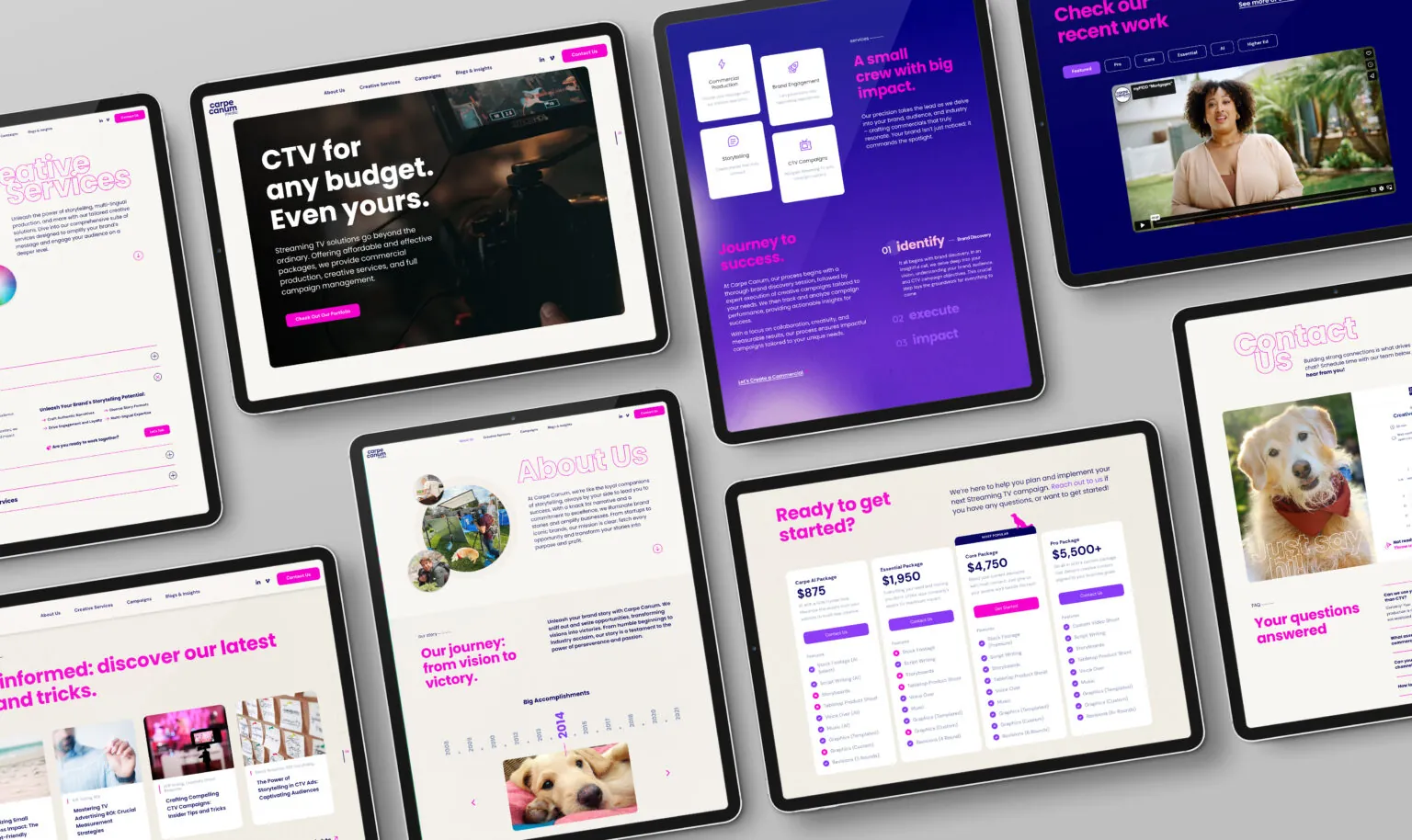
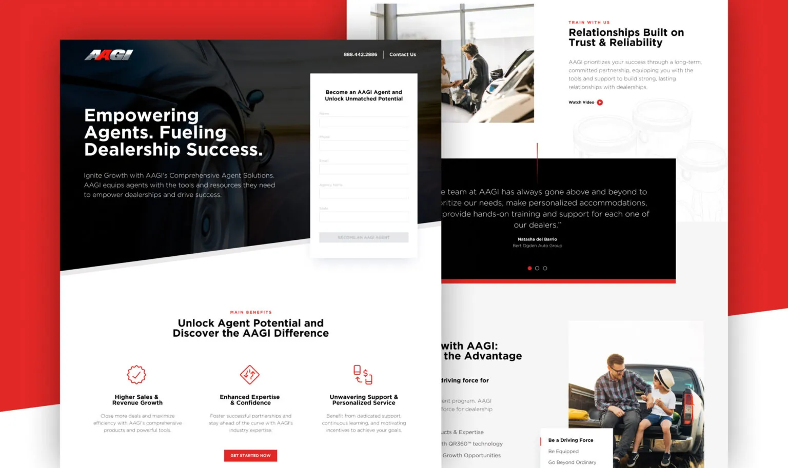
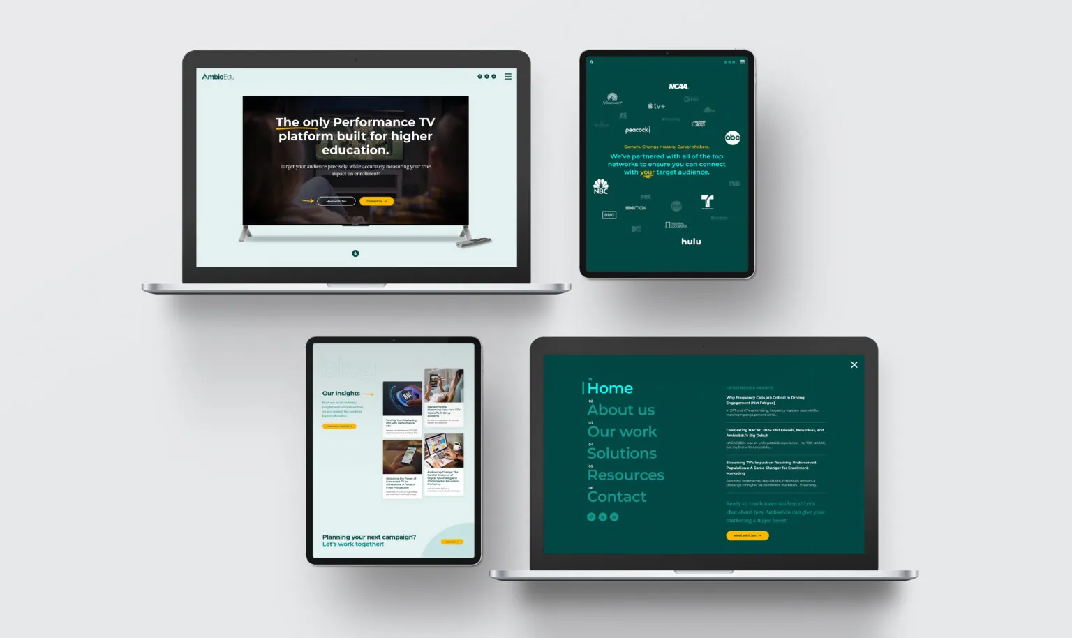
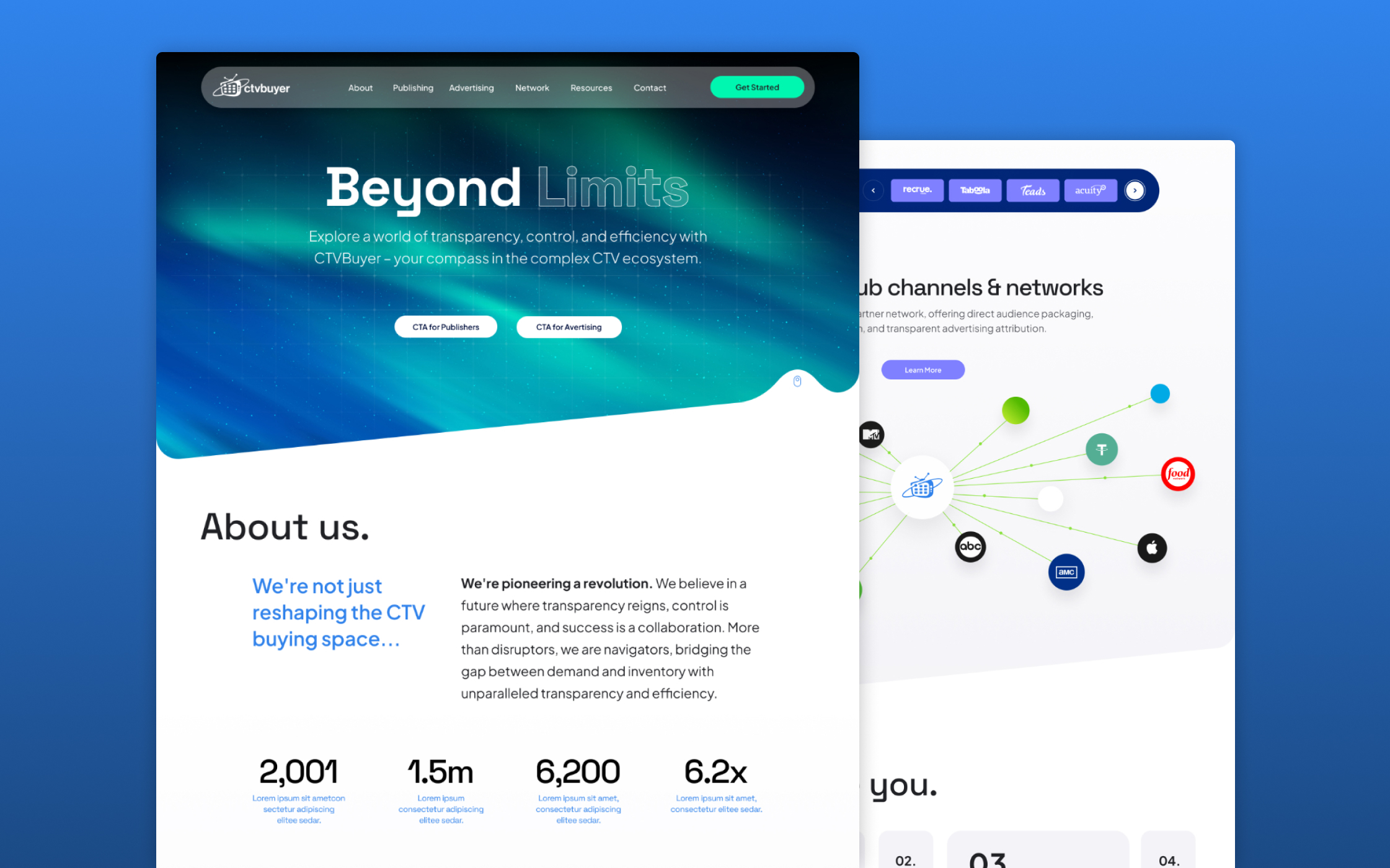
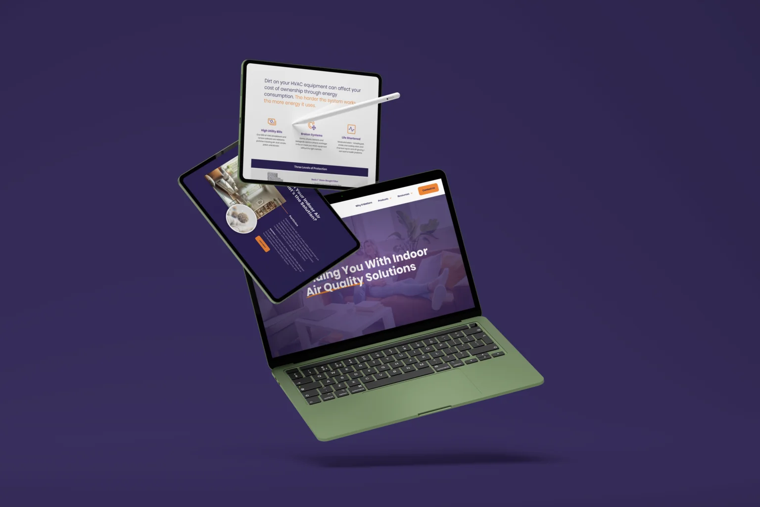
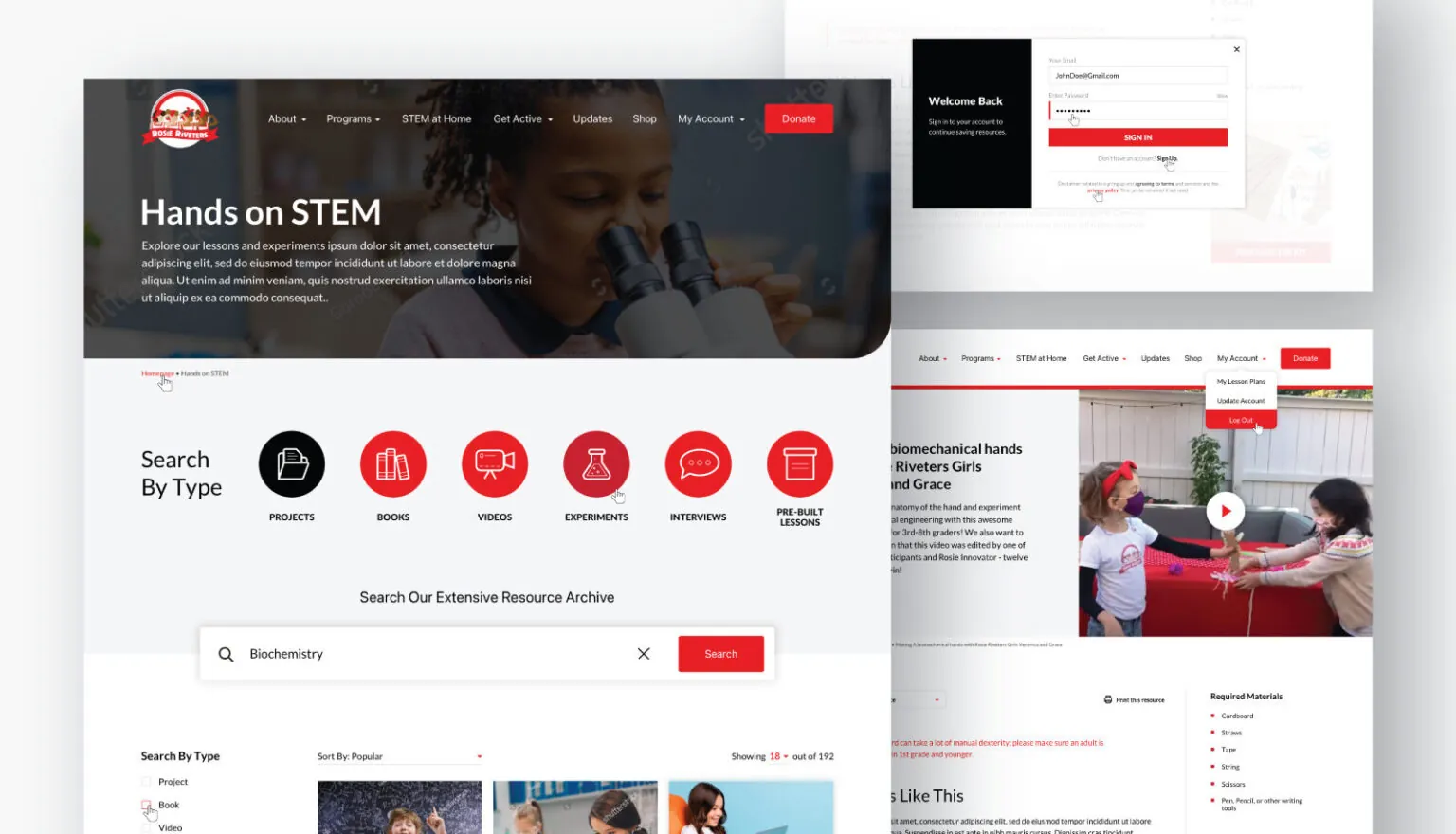
To see examples of responsive designs in action, explore our portfolio for real mobile friendly experiences.