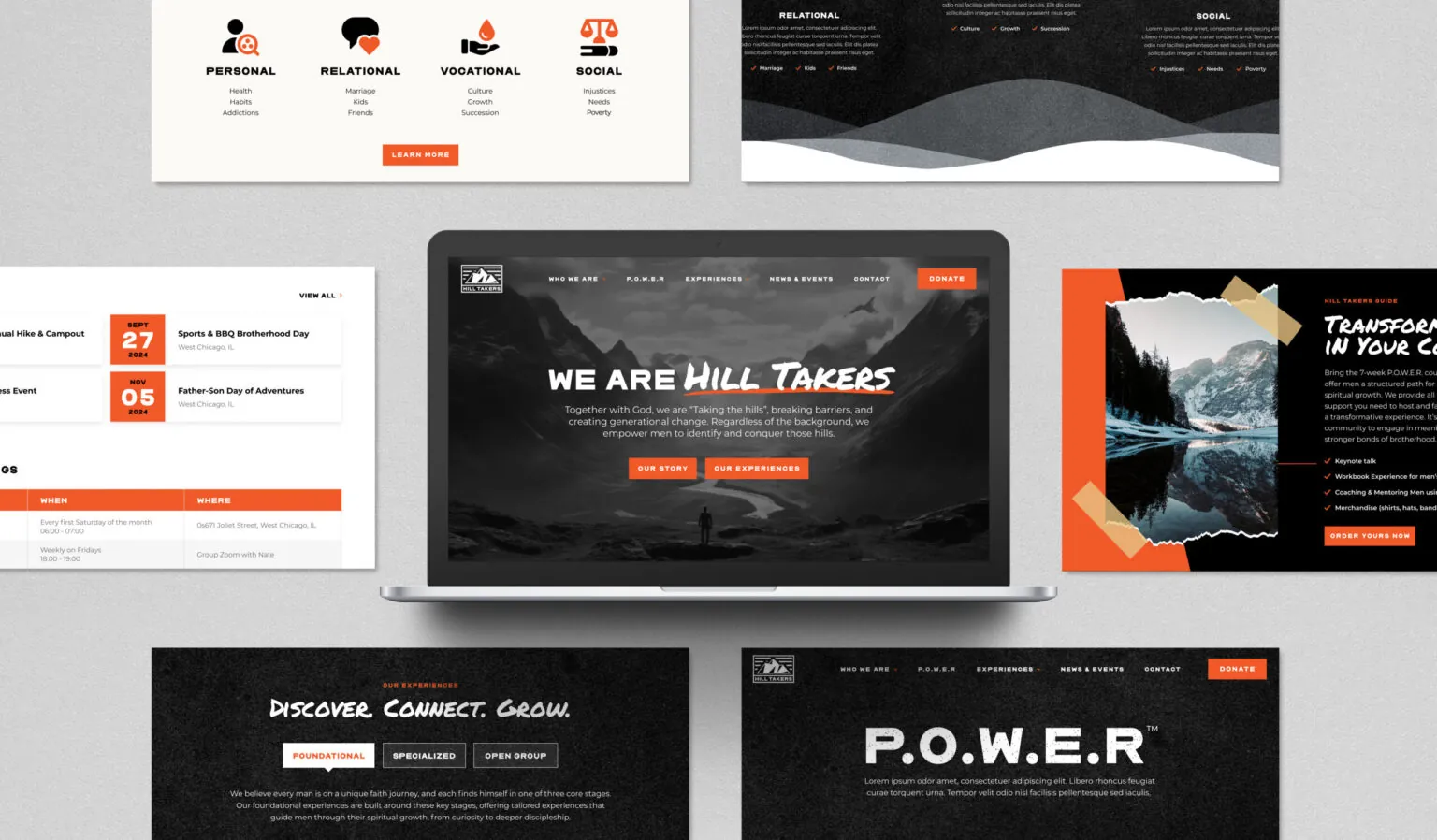
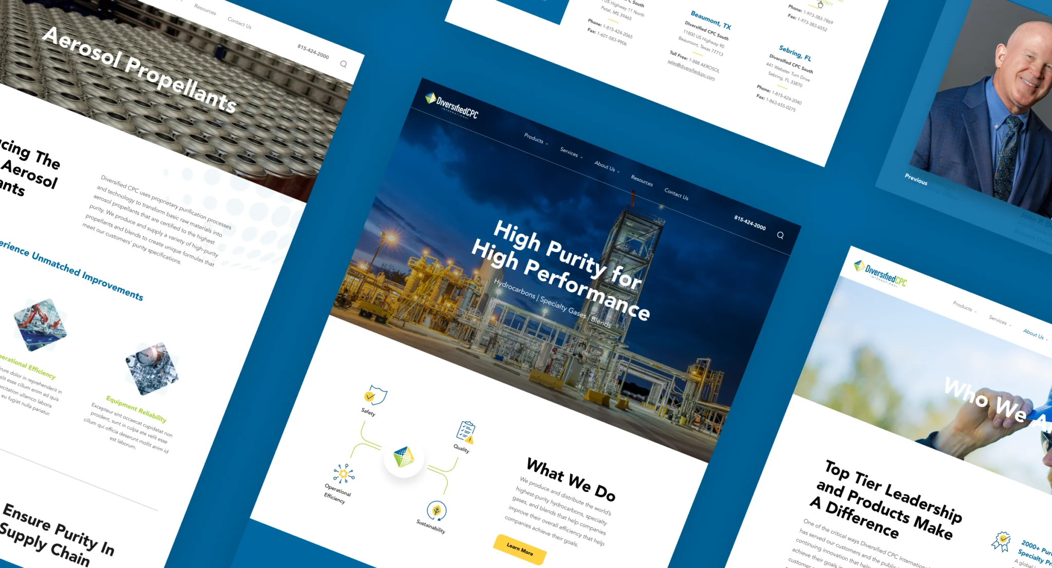
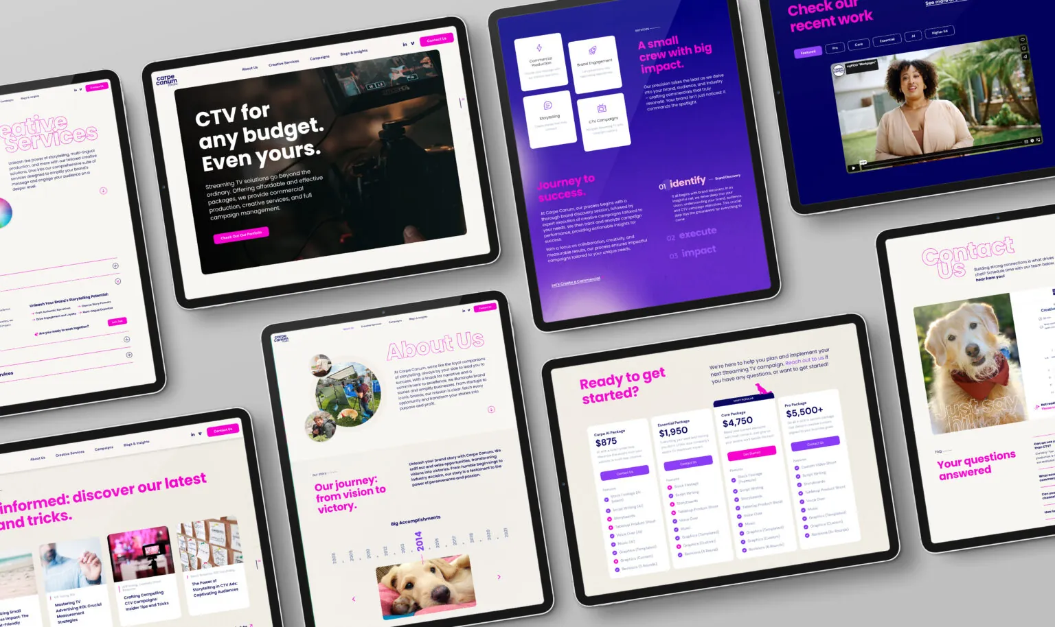
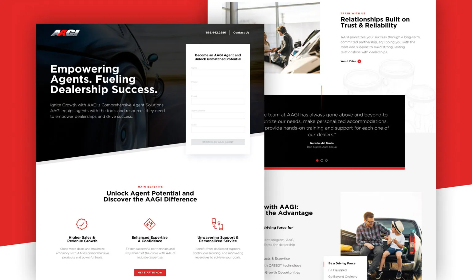
What Responsive Web Design Means for Chicago Businesses
Responsive web design is the process of designing a website that adapts intelligently to different screen sizes and device behaviors. That sounds simple, but many sites still treat mobile as an afterthought, resulting in layouts that feel cramped, confusing, or difficult to use.
Responsive web design should ensure:
- Content remains readable and easy to scan
- Navigation stays intuitive on smaller screens
- Calls to action remain clear and accessible
- Layouts adapt without breaking hierarchy
- Performance stays fast across devices
In Chicago, where users frequently research on mobile and convert later, responsive design helps your website stay consistent throughout the decision process.
Why Mobile-First Usability Matters
Many Chicago businesses invest heavily in branding, messaging, and content, then lose opportunities because the mobile experience feels frustrating. If a user cannot find what they need quickly, they rarely try again.
Responsive web design improves:
- First impressions and credibility
- Time on page and engagement
- Lead form completion and contact intent
- Clarity for users evaluating services quickly
Responsive design is not about shrinking the desktop site. It is about designing the experience intentionally for each device context.
Responsive UX Strategy Comes Before Layout
Responsive design works best when it is guided by UX strategy, not just breakpoints. Before we design interfaces, we plan how users should move through your content across devices.
Our UX planning focuses on:
- Content hierarchy and scannability
- Navigation patterns that reduce friction
- Clear paths to services, proof, and next steps
- Mobile-friendly content structure and spacing
For businesses that need deeper clarity and flow, our UX Web Design for Chicago approach strengthens user journeys before design even begins.
Responsive UI Design Built for Readability
Responsive UI design is more than rearranging sections. It requires deliberate design decisions that maintain clarity while adapting to device constraints.
Our responsive UI design includes:
- Typography and spacing rules that support readability
- Components designed to adapt across screen sizes
- Consistent visual hierarchy on every device
- Layouts built to support scanning and quick comprehension
When brand consistency needs refinement across the site, we support that through our branding capabilities so visuals remain cohesive across every screen size.
Navigation That Works on Mobile
Navigation is one of the most common failure points for responsive websites. What works on desktop often becomes cluttered on mobile.
We design mobile navigation to be:
- Easy to locate and use with one hand
- Organized around user intent, not internal structure
- Optimized for speed and minimal taps
- Consistent across key page types
When navigation improves, users find what they need faster and convert with more confidence.
Responsive Design and Performance
Responsive websites also need to load quickly. Large images, heavy scripts, and unoptimized assets can slow down mobile performance and reduce engagement.
Our web design and development process prioritizes:
- Clean, scalable component systems
- Optimized assets and efficient page builds
- Reliable responsiveness across browsers and devices
- CMS structures that support future expansion
The goal is a site that feels smooth and reliable, not fragile or inconsistent.
Graphic Design That Supports Responsive Clarity
Responsive design is stronger when visuals are planned intentionally. Our in-house graphic designers support responsive web projects with custom illustrations, icons, and digital assets designed to stay clear at any size.
This work is supported by our graphic design capabilities and helps reduce clutter, reinforce hierarchy, and improve scannability on smaller screens.
Responsive Web Design and SEO
Responsive design supports search visibility by improving usability, engagement, and site structure. When users stay longer and navigate more easily, performance signals improve.
When appropriate, we align responsive design decisions with our SEO services to support:
- Clear page hierarchy and structured content
- Mobile-friendly readability and navigation
- Reduced bounce from confusing layouts
- Scalable templates for future content growth
Responsive design and visibility work best when they support each other.
Responsive Redesigns for Chicago Websites
Many Chicago businesses come to us because their current site is not responsive enough or does not feel usable on mobile. Sometimes this requires a full redesign. Other times it is a targeted restructure.
If you are unsure whether to refresh or rebuild, explore our Website Redesign Services for Chicago approach to see how we modernize UX and layout without guessing.
Related Chicago Web Design Services
Responsive web design often works alongside:
Why Rawcut Creative
We build responsive websites that feel clear, modern, and intentional. By combining discovery, UX strategy, custom design, and disciplined development, we help Chicago businesses deliver consistent experiences across every device.