Brand Identity Design in Orlando

Brand identity is the complete visual and verbal system that communicates what a business is, who it serves, and why it is worth choosing before the buyer reads a single sentence of copy. In Orlando’s competitive professional service market, where a buyer may compare four or five medical specialists, law firms, or financial advisors in an afternoon of online research, the identity that communicates professional quality and specific positioning most clearly wins the first impression. Generic identities that blend into the category average do not win that comparison. Distinctive, coherent identities built for the specific market and the specific buyer do.

Rawcut Creative designs brand identities for Orlando businesses that need to stand out in specific markets, not just look professionally adequate. Our brand identity work covers the complete visual and verbal system: logo design, color palette, typography, iconography, messaging framework, and the documented rules for applying all of these elements consistently across every context. We work with healthcare practices in the Lake Nona Medical City cluster, financial advisory groups in Winter Park and Maitland, law firms in Downtown Orlando, technology companies on the I-4 corridor, and professional service businesses across Orange, Seminole, and Osceola counties. See our branding capabilities.

START YOUR PROJECT
 

What Brand Identity Design Includes

Logo Design

The logo is the most visible element of the brand identity, but designing a logo without the surrounding color palette, typography system, and application guidelines produces an asset that will be applied inconsistently the moment it is used in real contexts. We design logos as part of a complete system. See our Orlando logo design page for details on the logo development process.

Color Palette

Color communicates positioning before the viewer consciously processes it. A wealth management firm in Windermere serving ultra-high-net-worth clients, a technology company on the I-4 corridor, and a pediatric dental practice in Altamonte Springs should each have completely different color palettes because their audiences have completely different emotional associations and expectations. We select colors based on the specific positioning of the Orlando business and the buyer psychology of its target audience.

Typography System

Typography carries professional character and signals credibility or its absence quickly. An Orlando law firm using casual or decorative typefaces signals the wrong character for its category. A financial advisory firm using the same default fonts as every other practice in the Maitland financial corridor is visually invisible. Typography for Orlando professional service brands needs to communicate appropriate authority, clarity, and specific character, and must be specified precisely enough that anyone producing materials for the business applies it consistently.

Messaging Framework

The verbal component of the brand identity: a defined value proposition, consistent positioning language, tone of voice guidelines, and key messages for each primary buyer segment. We develop messaging frameworks as part of comprehensive brand identity engagements so the brand communicates coherently in writing as well as visually across every buyer touchpoint in the Central Florida market.

Brand Identity for Orlando’s Competitive Markets

The Orlando market rewards specificity over genericism in brand positioning. A Lake Nona specialty medical practice that presents with the clinical authority its patient population expects consistently outperforms a practice with a generic healthcare brand in the same competitive search environment. A Maitland financial firm that communicates specific expertise for a defined client type, whether that is corporate executives, medical professionals, or business owners preparing for exit, consistently generates higher-quality referral conversations than one whose brand says nothing specific about who it serves best.

Ready to Level Up?
This field is for validation purposes and should be left unchanged.

If you’re ready to stop playing small and start marketing with intention, we’re here for it. Let’s build something that looks amazing, performs even better, and gets people talking.

Full Name*(Required)
Latest Posts
Our Work

Featured Projects

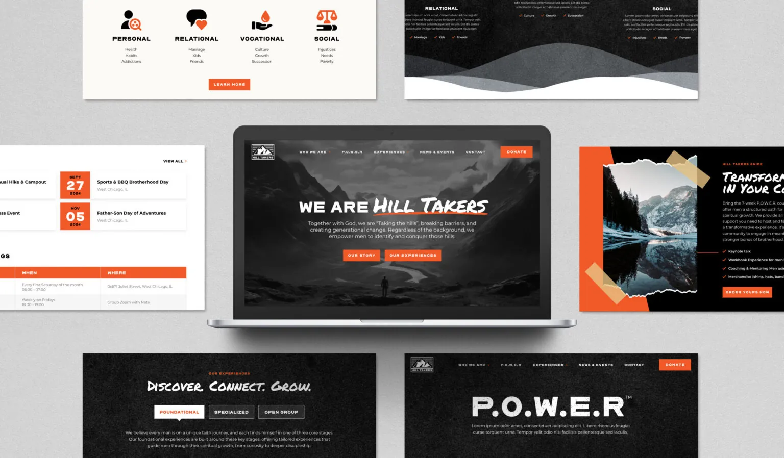
Hill Takers: Website, Development

DCPC-main

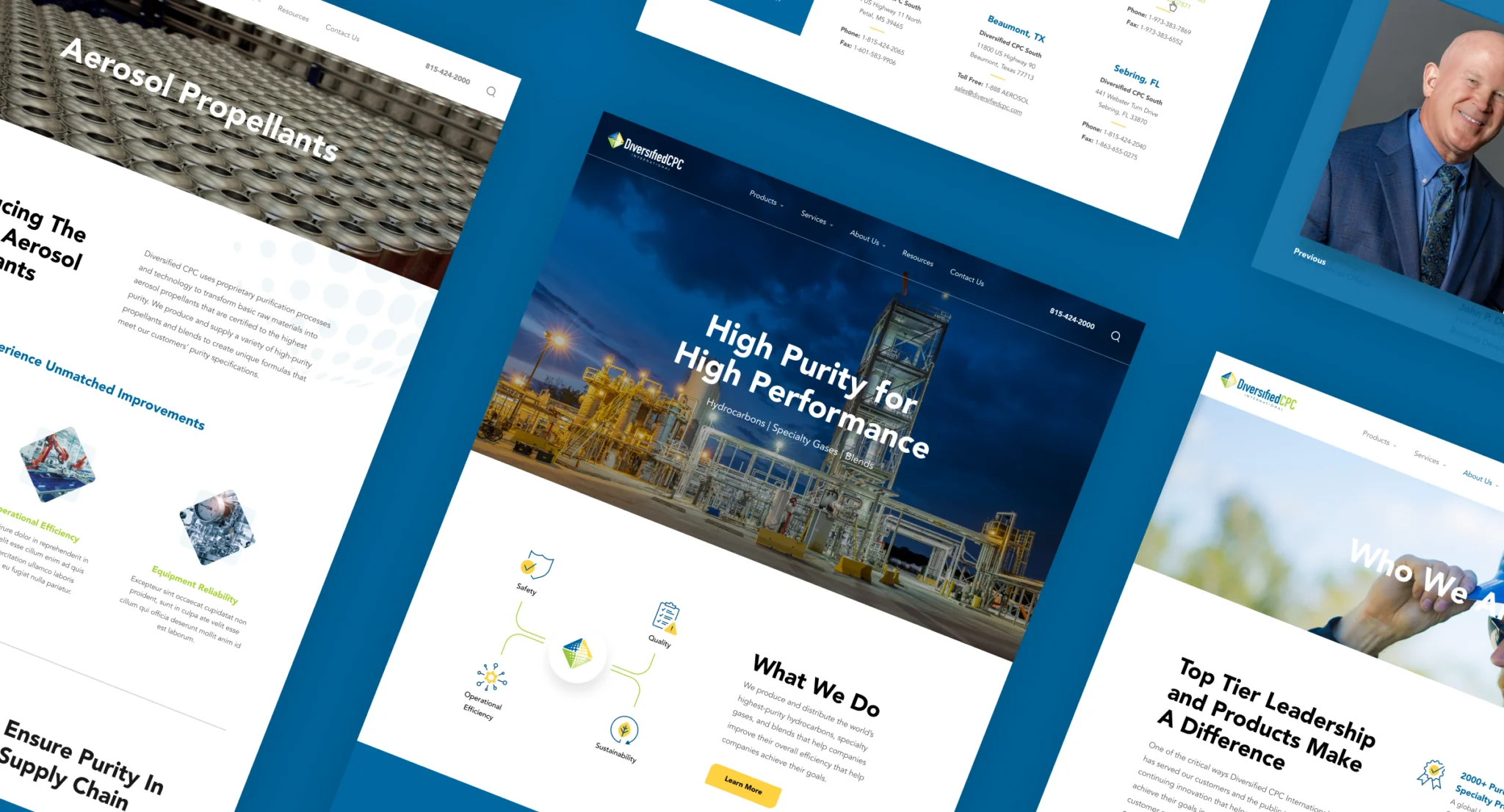
Diversified CPC: Website, Development, SEO, Marketing, Design

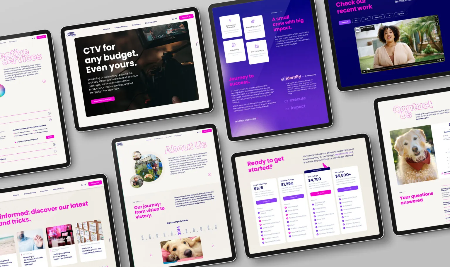
Carpe Canum: Website, Development, Brand Strategy

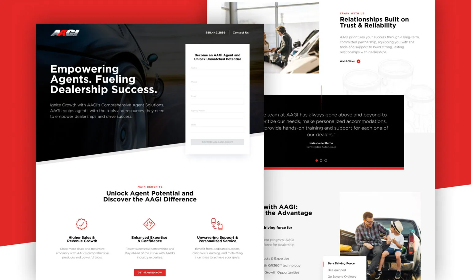
American Auto Guardian: Website, Development

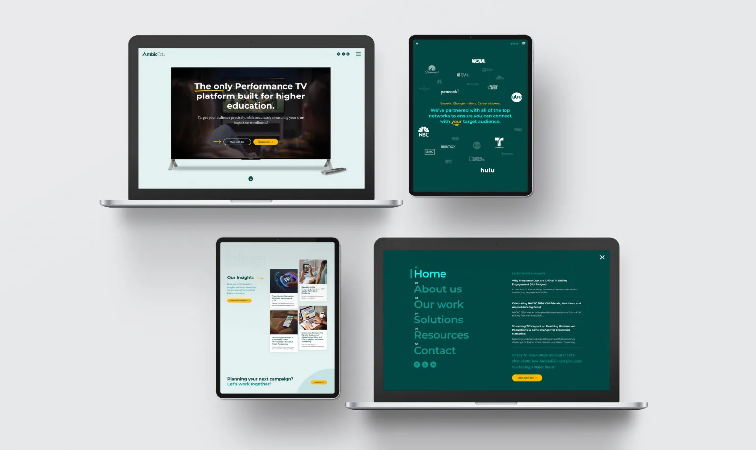
Ambio Edu: Website, Development, Google My Business Setup

CTV Buyer

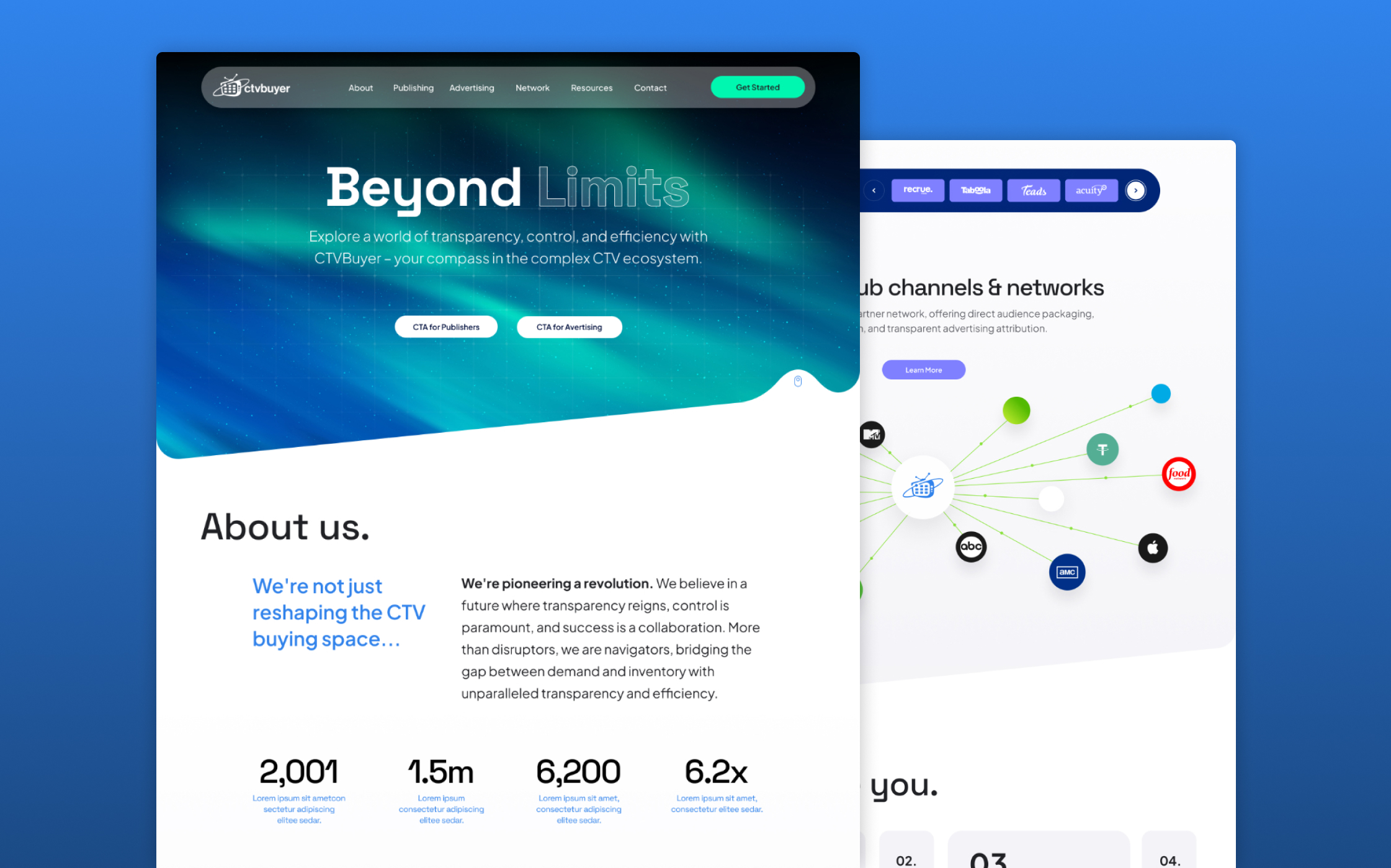
CTV Buyer: Website, Development, SEO

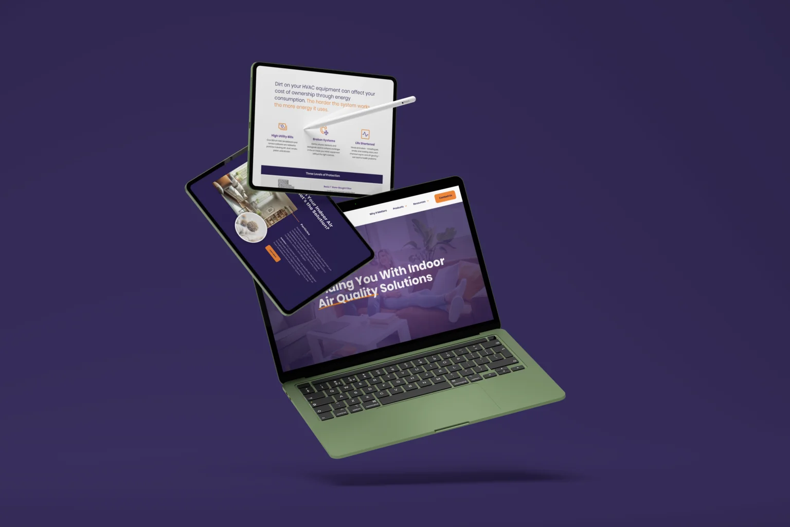
Elevated Air: Website, Development

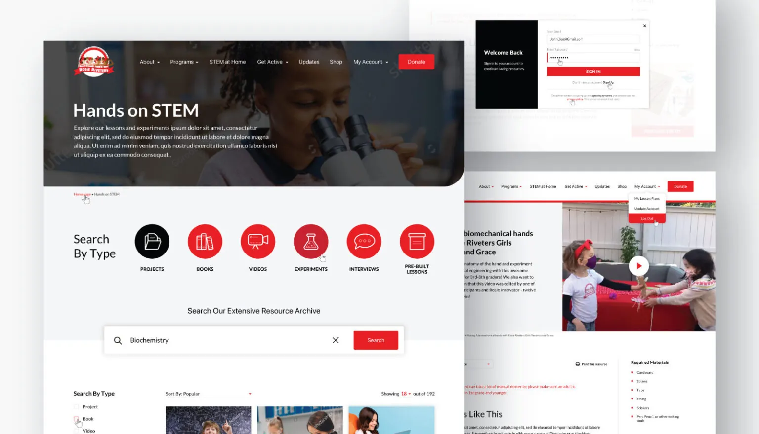
Rosie Riveters: Website

Word On the Street
This team is incredible in every way! They are a fun group to work with, and their creativity is amazing. I am so, so happy to have them working on my website! After the preview this week, I can't wait for the full reveal!”
We had the pleasure of working with Rawcut Creative on a complete redesign of our CTVBuyer website, and the experience exceeded all expectations. Their team brought a fantastic blend of creativity, technical skill, and strategic insight that truly elevated our brand’s online presence. From the initial planning stages to the final execution, Rawcut was incredibly attentive to our vision and provided valuable recommendations to enhance both design and functionality.”
Rawcut Creative helped us bring Elevate Home Services to life—from defining our brand to launching it across every touchpoint. Their creativity, speed, and strategic thinking made a huge difference. We rely on them for everything from brand development to creative support.”
You’ve found a gem. Rawcut Creative has the talent and business acumen to produce exceptional work in a timely and professional manner. Working with Jacob is a pleasure. He is a creative collaborator who listens, asks the right questions, and brings a fresh perspective to every project. I highly recommend Rawcut Creative.”
Jennifer Lonchar
Jennifer Lonchar AmbioEdu
Michaela Crudele CTV Buyer
Justin Carrol
Justin Carrol Elevate Home Services
Kerry Carey
Kerry Carey Diversified CPC

Frequently Asked Questions

We’ve Got the Answers

What is the difference between a logo and a brand identity for an Orlando business?

A logo is a single mark. A brand identity is the complete system: the logo and all its variations, color palette with exact digital and print specifications, typography with hierarchy and usage rules, imagery direction, messaging guidelines, and the application rules that ensure consistent use. An Orlando business with only a logo and no identity system presents inconsistently across different materials and vendors, which accumulates into a fragmented brand impression that undermines the investment in the individual design pieces.

How long does brand identity design take for an Orlando business?

A complete brand identity project covering strategy, logo, color palette, typography, and basic guidelines typically takes eight to twelve weeks from kickoff through final delivery for an Orlando professional service or healthcare business. Projects with more extensive collateral applications, a larger messaging framework, or photography to support the new identity take longer. We provide a specific timeline at the proposal stage based on the agreed scope.

Can I update just my logo without redesigning my whole brand identity?

Yes. A logo update or refresh is a defined scope we handle for Orlando businesses that need to modernize their mark without a complete brand overhaul. We assess the current logo, identify what is working and what is limiting its effectiveness, and deliver an updated version that resolves the specific issues while preserving any equity and recognition the existing mark has already built with current clients and referral sources.

Amplify Your Brand.

Let’s Build Something Bold, Orlando, FL.

If your website needs to support trust, clarity, and regional growth, let’s talk.

START YOUR PROJECT