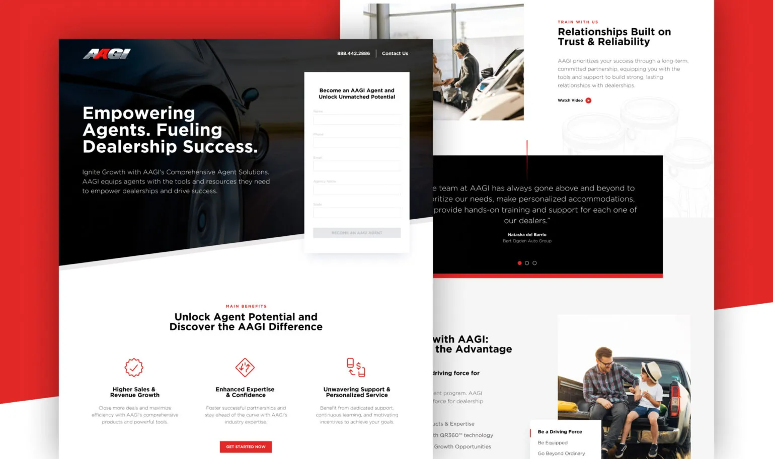
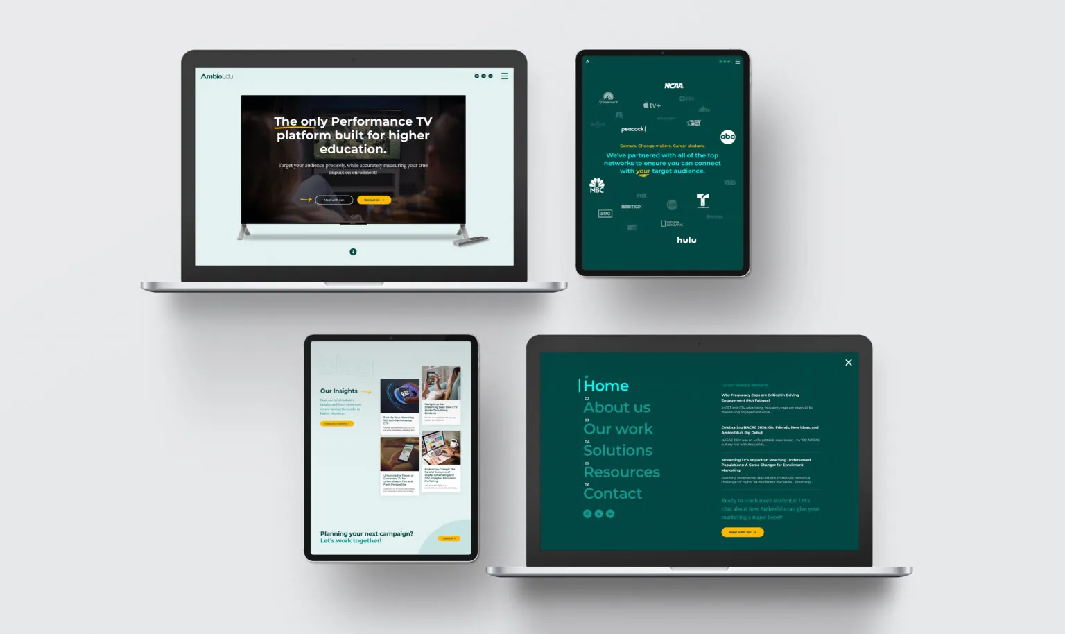
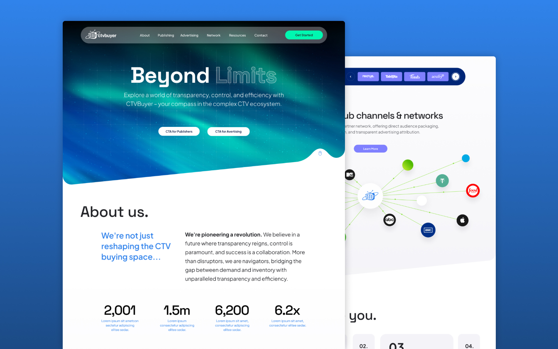
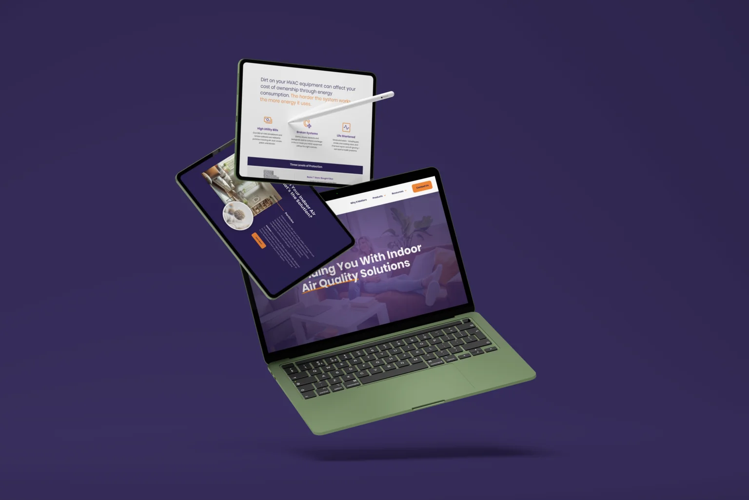
Many Orlando businesses reach a point where the current brand is not fundamentally wrong, it is just no longer quite right. The logo looks dated relative to current competitors who have invested in more modern visual systems. The colors feel heavy or inconsistent across different materials because different vendors have been interpreting them independently over the years. The typography is visually out of step with what the Orlando market now expects from a business at the current scale and positioning. The business has grown and changed since the brand was originally designed, and the brand now feels like a record of where the business was rather than a representation of where it is today and where it is heading.
Rawcut Creative provides brand refreshes for Orlando businesses that need to modernize their visual identity without the full cost and disruption of a complete rebrand. A refresh preserves what has equity , the brand colors and general direction if they are still right, the basic positioning and personality , while updating the logo execution, refining the typography, cleaning up the color palette to exact specifications, and resolving the inconsistencies that have accumulated over time. We have refreshed brands for Orlando financial firms modernizing after a decade of stability, medical practices in the Lake Nona area updating their brand for a new patient generation, and professional service businesses throughout the metro that have outgrown their original visual system. See our full Orlando branding page.
START YOUR PROJECT