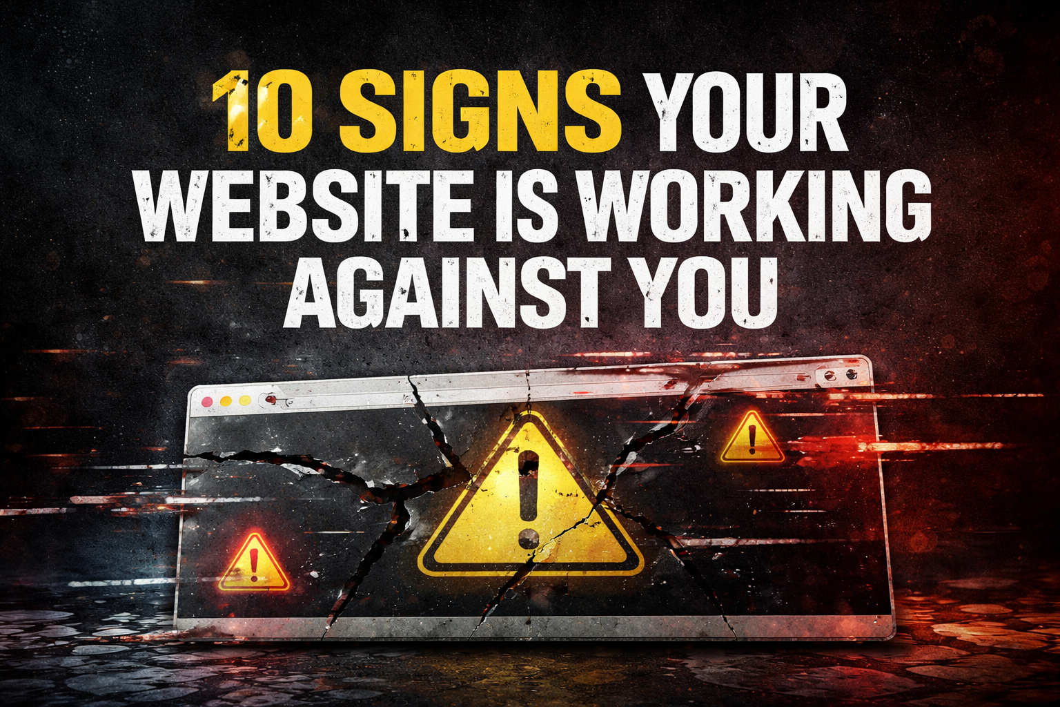
Far too many companies have a website they refuse to confront.
It loads. It exists. Someone once approved it. So now it lingers. Defended in meetings. Avoided in conversations. Quietly undoing your credibility one visitor at a time.
If your site launched in 2017 and the general consensus is “it’s probably fine,” this post is for you.
1. The nicest thing anyone can say is “it still works”
That is not praise. That is surrender.
No one describes a high-performing website this way. They say it converts. It drives leads. It supports sales. “It still works” is what people say about a printer they hate.
2. Mobile feels like an afterthought
Yes, it technically shows up on a phone. That is not the same as being usable.
If your site was clearly designed on a desktop and then shoved into a smaller screen, users feel it instantly. They do not admire your effort. They leave.
3. Your homepage is doing emotional labor it should not have to do
It is explaining. Justifying. Overcontextualizing.
If your homepage reads like it is trying to convince the reader to care instead of immediately showing them why they should, you already lost them.
4. Your navigation is a museum of past decisions
Every dropdown tells a story. None of them are good.
Pages added for reasons no one remembers. Sections kept because “someone might need that.” Nothing ever removed. Just layered on until the whole thing collapses under its own weight.
5. Your content sounds like it was optimized by fear
Every sentence is packed with keywords. Every paragraph hedging. Everything saying nothing clearly.
Search engines grew up. Your content should too.
6. Updating the site feels dangerous
If changing a headline requires a meeting, a backup, and a prayer, your website is not a tool. It is a liability.
Modern sites are built to evolve. Yours is built to be left alone.
7. The design instantly dates you
Visitors do not consciously think “this site is old.” They think “this company feels behind.”
Outdated design quietly suggests outdated thinking. Fair or not, that is how people judge you.
8. You cannot clearly say what problem you solve
If your website cannot explain your value in one sentence, your sales team is doing too much work.
Clarity is not boring. Confusion is expensive.
9. Your calls to action are weak or hidden
Contact links tucked away like they are embarrassing. Forms that feel like punishment. CTAs that whisper instead of lead.
If your site is not confidently guiding users to act, it is wasting traffic.
10. You are defending it out of exhaustion, not confidence
This is the real tell.
You are not proud of the site. You are just tired. Tired of dealing with it. Tired of reopening the conversation.
So it stays. And quietly underperforms.
Let’s be clear about the real issue
Your website is not bad because it is old. It is bad because it no longer matches the business you are running today.
Your company evolved. Your site froze in time.
A refresh will likely not save it
New colors will not fix unclear messaging. A new font will not fix bad structure. SEO tweaks will not make a site feel credible if the foundation is wrong.
Strong websites are systems. Strategy, messaging, design, structure, performance, and visibility working together.
Anything else is cosmetic.
The uncomfortable truth
Your website might not be broken.
But it is probably holding you back.
And pretending otherwise is the most expensive strategy you have.
Ready for an honest assessment?
If any of this sounded familiar, your website does not need defending. It needs an honest assessment.
Our Website Audit looks at what actually matters. Messaging, structure, design, usability, performance, and how well your site supports sales and marketing today, not when it launched.
No fluff. No generic scorecards. No false praise. Just a clear breakdown of what is working, what is holding you back, and what to fix first.
If you want clarity instead of guesses, this is where to start.