K9 Driven Chicago
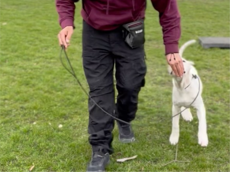
A Dog Training company that is dedicated to helping dogs and their owners build strong, happy, and healthy relationships.

The Challenge
K9 Driven approached us with the hopes of recreating a logo that more accurately represented the company and customers. The previous logo looked awesome but was leaned into a more aggressive look which is not what the company wanted representing them to avoid potential customers getting the wrong idea about their services.
The OUTCOME
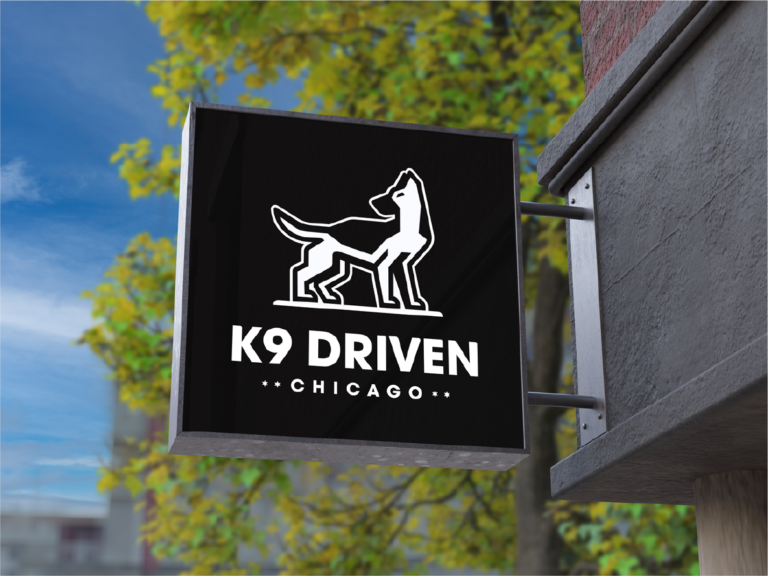
After several different concepts, we landed on a mark that has a more friendly appearance that better represents the look and feeling K9 Driven was hoping to achieve. The new logo gives K9 Driven the opportunity to continue growing as they attract more customers.
Perfecting the one
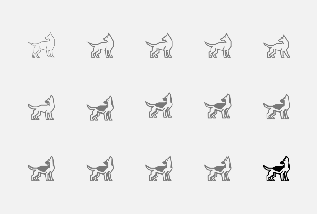
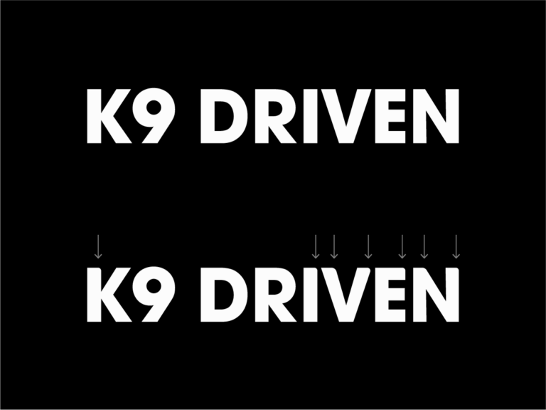
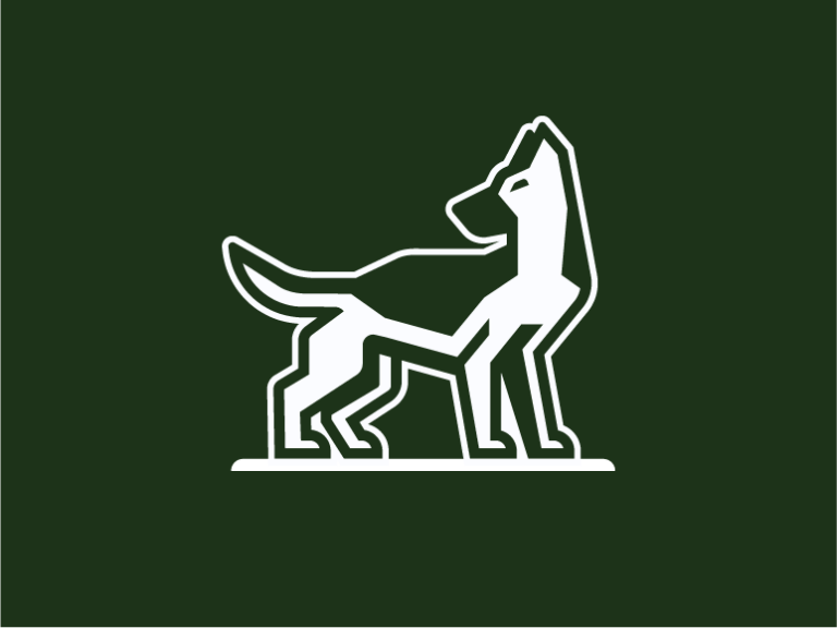
Between all the concepts and compositions we worked on, the version K9 Driven wanted to move forward with takes a simplified and modern approach by using geometric shapes to achieve a strong composition. We worked diligently on creating a mark that shows a dog with confidence, which comes with great training. The head tilted backwards implies action and movement while the blend of thick lines and filled-in shapes helps create a visual and balanced mark. This option also features custom touches to the typography to help make it one cohesive and friendly logo.

Building for the Future
K9 Driven wanted a black logo, but we wanted to push what’s comfortable into the unknown. The final result gave us a powerful mark that works in both horizontal and vertical formats. A unique challenge with this mark is our brains visually want the top hair of the dog to be dark, so we had to create a reversed-out variation that would work the same way the mark on a lighter background did. Our solution allows the logo to work with multiple different colors, allowing the brand’s visual identity to grow into an exciting and vibrant brand.


Expanding the brand
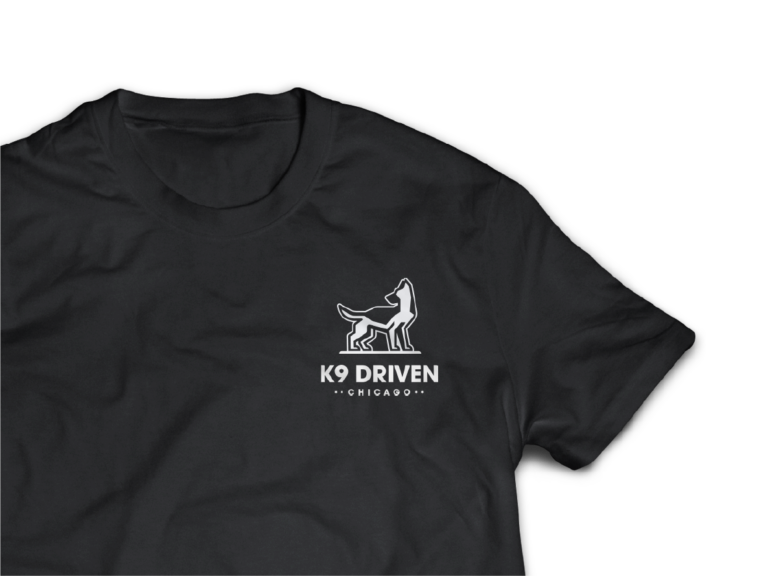
We knew ahead of time that this logo was going to be used on multiple types of collateral. As part of our process, we made sure the brand felt strong on shirts, signs, and vans.
