

Kings Brew Company
A brewery beer label concept with a story to be told with every twist and turn of the can.
The Challenge
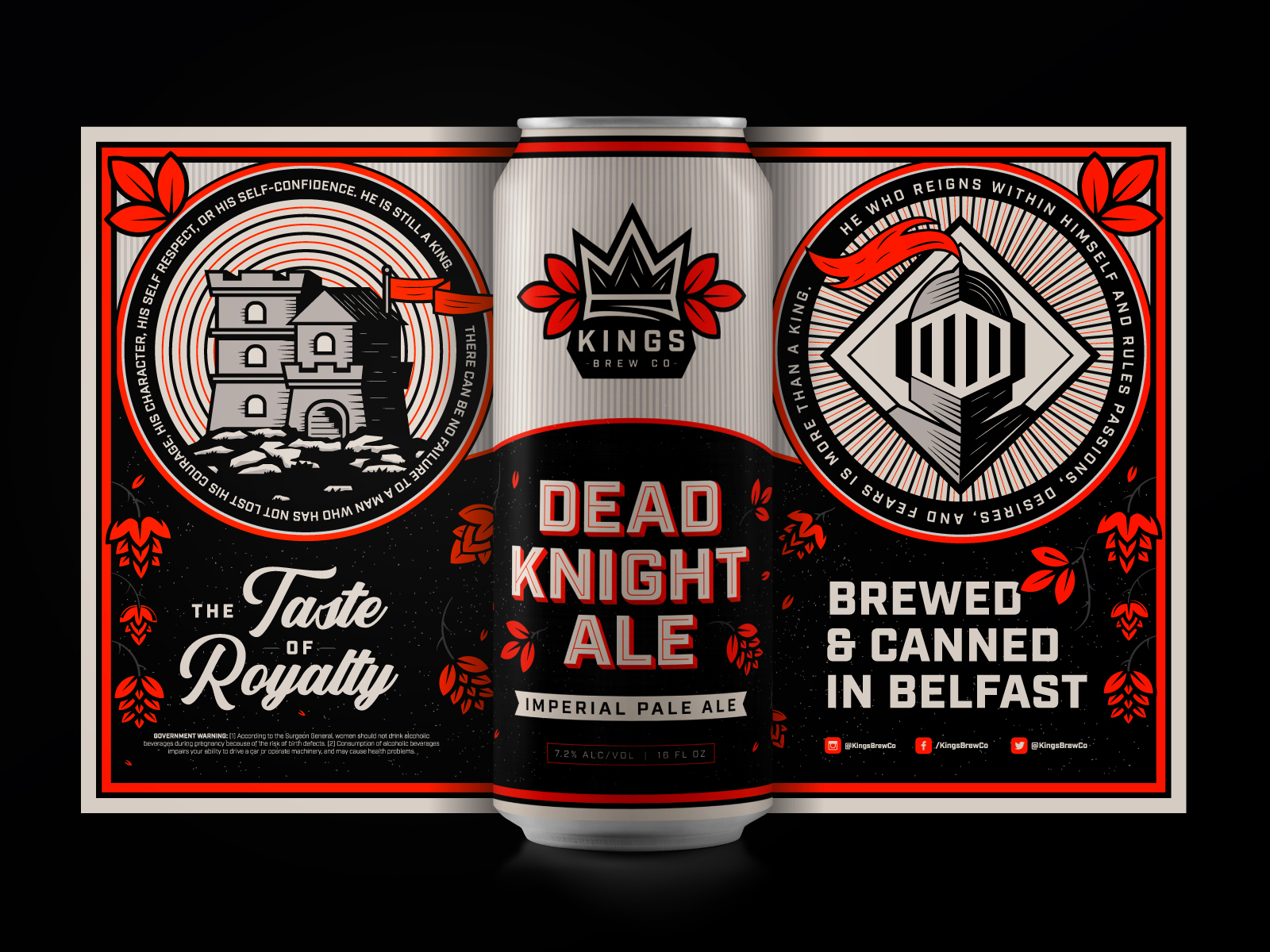
Dead Knight Ale by Kings Brew Company is an imperial pale ale with one hell of a story to tell. With the idea to tell a story with every turn of the can, we dove into the smallest details to create a single-colored vibrant can that stands out on the shelves.
The OUTCOME
Can we agree that branding for breweries is super rad? The bright orange compliments the brand’s grungy vibe and demanding stacked logo. We were stoked to see how this logo design for Kings Brew Company turned out!
A Story To Be Told
Kings Brewing Company was developed around the idea of creating a beer label that tells a story using engaging graphics with color limitations. We had fun putting this design together for Kings Brewing’s Dead Knight Ale and are excited to do more beer-label graphics in the future!
The Finest of Details
From the custom typeface to the small graphics, the idea behind the can design was for there to be a story told with very turn of the can. Every inch, every detail, every phrase, has its own story to be told. There are little hidden gems, making it addictively fun as you kick the feet up and enjoy a cold one.


Related work

Advocate Children’s Hospital
- Graphic Design
- Marketing

Campaigns and Elections
- Development
- Web Design