

Equalize Digital
A digital agency that helps companies make sure all people have access to your products and services through website accessibility.
The challenge
Equalize Digital, originally known as Accessibility First, is filling the void between accessibility and good website design. They strive to make your website accessible and want to make sure all people have equal access to your products and services regardless of their ability. Our goal was to update their current logo and redesign their homepage and service web pages so that they would match their brand’s aesthetic and style. These new pages had to migrate flawlessly into the existing web pages.
The outcome
Creating a WCAG-compliant website that is fun and exciting isn’t always the easiest to accomplish. There are a handful of rules designers and developers have to follow to accomplish an accessible website. However, we were able to accomplish an engaging and friendly website that allows users to quickly learn about Equalize Digital and what services they offer that can help make your website more accessible. And of course, leading by example, their website is completely WCAG complaint.
Improving The User First Look
The key to finding success with this project wasn’t just to match their current brand styling on existing pages, it was to find new ways we could elevate it. We leaned into their bright and contrasting colors to create a website that really “pops”. The color helps drive the eye down the page toward elements such as buttons and key points of information. We worked on improving the story being told by carefully considering the information hierarchy of the homepage which starts with who they are, what it can do for you, what they offer, testimonials for validation, and how to get started.

Reworking The Brand
Previously, Equalize Digital was known as Accessibility First. Though it may seem like a small task to rework a logo to the new name, it comes with its own challenges that we were ready to accept. With this logo, we had to make sure the composition was correct so that the balance of the text size was legible and felt correct. Additionally, we had to make sure the colors used would work well on dark and light backgrounds so that it would also pass WCAG compliance as the brand expanded.
![]()
Related work
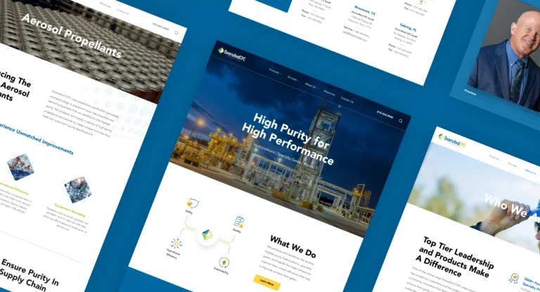
Diversified CPC
- Graphic Design
- Marketing
- Web Design

Advocate Children’s Hospital
- Graphic Design
- Marketing